> ## Documentation Index
> Fetch the complete documentation index at: https://docs.definite.app/llms.txt
> Use this file to discover all available pages before exploring further.
# Tile Types Reference
> Configuration options and examples for KPI, Chart, Table, and Markdown tiles
Users need the **Admin** [role](/workspace) to create and edit tiles. Analysts have read-only access.
This page covers the configuration options and examples for each tile type. For an overview of how tiles work, see [Introduction to Tiles](/analyze-build/docs/tiles).
***
## KPI tiles
KPI tiles display single metrics prominently. They're perfect for key performance indicators that need to stand out at a glance.
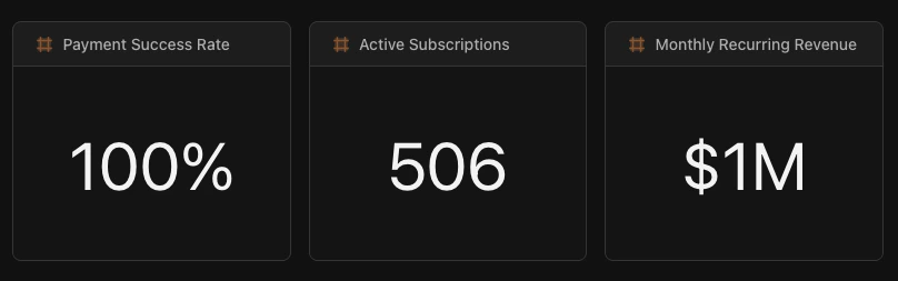 ### When should I use a KPI tile?
Use KPIs when you have a single number that stakeholders check regularly: total revenue, conversion rate, active users, or any metric that answers "how are we doing?"
### Configuration options
| Option | Description |
| ----------- | ------------------------------------------------------------ |
| **Source** | The dataset containing your metric |
| **Field** | The column to display |
| **Format** | How to display the value: `currency`, `percent`, or `number` |
| **Color** | Customize the display color (hex code) |
| **Compare** | Optional comparison to previous period |
### Example
```yaml theme={null}
# KPI showing total revenue collected in last 90 days
engine: "sql"
sql: |
SELECT SUM(amount) as total_collected
FROM LAKE.STRIPE.charges
WHERE status = 'succeeded'
AND to_timestamp(created) >= CURRENT_DATE - INTERVAL '90 days'
viz:
type: "kpi"
series:
- field: "total_collected"
format: "currency" # Display as $X,XXX
colors:
color: "#10b981" # Green
```
***
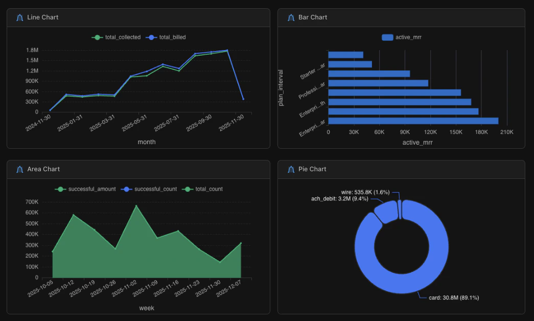
## Chart tiles
Chart tiles visualize data graphically. You can choose from line, area, bar, or pie charts depending on what you're trying to show.
### Chart types
| Type | Best for | Example use case |
| -------- | --------------------------- | ---------------------------------------- |
| **Line** | Trends over time | Monthly revenue, daily active users |
| **Area** | Trends with volume emphasis | Cumulative signups, stacked metrics |
| **Bar** | Comparing categories | Revenue by region, sales by product |
| **Pie** | Proportions of a whole | Revenue by payment method, users by plan |
### When should I use a KPI tile?
Use KPIs when you have a single number that stakeholders check regularly: total revenue, conversion rate, active users, or any metric that answers "how are we doing?"
### Configuration options
| Option | Description |
| ----------- | ------------------------------------------------------------ |
| **Source** | The dataset containing your metric |
| **Field** | The column to display |
| **Format** | How to display the value: `currency`, `percent`, or `number` |
| **Color** | Customize the display color (hex code) |
| **Compare** | Optional comparison to previous period |
### Example
```yaml theme={null}
# KPI showing total revenue collected in last 90 days
engine: "sql"
sql: |
SELECT SUM(amount) as total_collected
FROM LAKE.STRIPE.charges
WHERE status = 'succeeded'
AND to_timestamp(created) >= CURRENT_DATE - INTERVAL '90 days'
viz:
type: "kpi"
series:
- field: "total_collected"
format: "currency" # Display as $X,XXX
colors:
color: "#10b981" # Green
```
***
## Chart tiles
Chart tiles visualize data graphically. You can choose from line, area, bar, or pie charts depending on what you're trying to show.
### Chart types
| Type | Best for | Example use case |
| -------- | --------------------------- | ---------------------------------------- |
| **Line** | Trends over time | Monthly revenue, daily active users |
| **Area** | Trends with volume emphasis | Cumulative signups, stacked metrics |
| **Bar** | Comparing categories | Revenue by region, sales by product |
| **Pie** | Proportions of a whole | Revenue by payment method, users by plan |
 ### When should I use a line chart vs a bar chart?
Use a **line chart** when showing how something changes over time: daily, weekly, or monthly trends. The x-axis is typically a date.
Use a **bar chart** when comparing discrete categories: regions, products, or segments. The x-axis is typically a category name.
If you're unsure, ask yourself: "Is time the main dimension?" If yes, use a line chart. If you're comparing groups, use a bar chart.
### Configuration options
| Option | Description |
| --------------- | --------------------------------------------------------- |
| **Source** | The dataset to visualize |
| **Type** | Chart type: `line`, `area`, `bar`, or `pie` |
| **Series** | Fields to plot and their axis assignments |
| **Colors** | Palette, scheme, or individual hex colors |
| **Legend** | Show/hide and position (`top`, `bottom`, `left`, `right`) |
| **Orientation** | `vertical` or `horizontal` (bar charts only) |
| **Stacked** | Stack multiple series (bar and area charts) |
### Example
```yaml theme={null}
engine: "sql"
sql: |
SELECT
DATE_TRUNC('month', created_at) as month,
SUM(amount) as revenue
FROM orders
WHERE created_at >= CURRENT_DATE - INTERVAL '12 months'
GROUP BY 1
ORDER BY 1
viz:
type: "line" # Change to "bar", "area", or "pie"
series:
- field: "revenue"
label: "Revenue"
format: "currency"
colors:
palette: "default" # Or use color: "#3b82f6" for a specific hex
legend:
position: "top" # top, bottom, left, right
orientation: "vertical" # Bar charts only: vertical or horizontal
```
### Type-specific options
| Chart type | Key options |
| ---------- | ------------------------------------------------------------------------------------- |
| **Line** | Multiple series for comparison, works best with time on x-axis |
| **Area** | Same as line, add `stacked: true` to stack multiple series |
| **Bar** | Set `orientation: "horizontal"` for horizontal bars, `stacked: true` for stacked bars |
| **Pie** | Use `label` in series to specify the category field for slices |
***
## Table tiles
Table tiles display query results in rows and columns. They're useful when users need to explore detailed data, drill into records, or export information.
### When should I use a line chart vs a bar chart?
Use a **line chart** when showing how something changes over time: daily, weekly, or monthly trends. The x-axis is typically a date.
Use a **bar chart** when comparing discrete categories: regions, products, or segments. The x-axis is typically a category name.
If you're unsure, ask yourself: "Is time the main dimension?" If yes, use a line chart. If you're comparing groups, use a bar chart.
### Configuration options
| Option | Description |
| --------------- | --------------------------------------------------------- |
| **Source** | The dataset to visualize |
| **Type** | Chart type: `line`, `area`, `bar`, or `pie` |
| **Series** | Fields to plot and their axis assignments |
| **Colors** | Palette, scheme, or individual hex colors |
| **Legend** | Show/hide and position (`top`, `bottom`, `left`, `right`) |
| **Orientation** | `vertical` or `horizontal` (bar charts only) |
| **Stacked** | Stack multiple series (bar and area charts) |
### Example
```yaml theme={null}
engine: "sql"
sql: |
SELECT
DATE_TRUNC('month', created_at) as month,
SUM(amount) as revenue
FROM orders
WHERE created_at >= CURRENT_DATE - INTERVAL '12 months'
GROUP BY 1
ORDER BY 1
viz:
type: "line" # Change to "bar", "area", or "pie"
series:
- field: "revenue"
label: "Revenue"
format: "currency"
colors:
palette: "default" # Or use color: "#3b82f6" for a specific hex
legend:
position: "top" # top, bottom, left, right
orientation: "vertical" # Bar charts only: vertical or horizontal
```
### Type-specific options
| Chart type | Key options |
| ---------- | ------------------------------------------------------------------------------------- |
| **Line** | Multiple series for comparison, works best with time on x-axis |
| **Area** | Same as line, add `stacked: true` to stack multiple series |
| **Bar** | Set `orientation: "horizontal"` for horizontal bars, `stacked: true` for stacked bars |
| **Pie** | Use `label` in series to specify the category field for slices |
***
## Table tiles
Table tiles display query results in rows and columns. They're useful when users need to explore detailed data, drill into records, or export information.
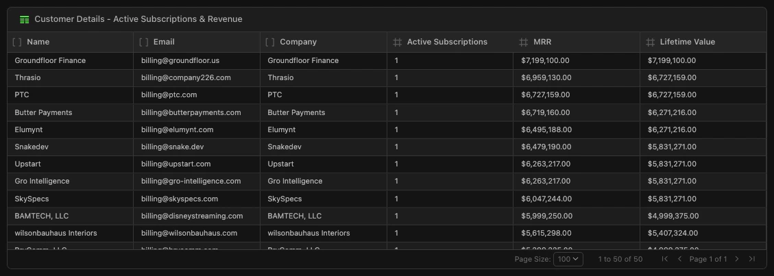 ### When should I use a table tile?
Use tables when:
* Users need to see individual records (e.g., list of customers, recent orders)
* The data has many columns that don't visualize well as a chart
* Users want to filter, sort, or search the data
* You're providing a drill-down from a summary metric
### Configuration options
| Option | Description |
| -------------- | ------------------------------------------- |
| **Source** | The dataset to display |
| **Columns** | Which columns to show and their order |
| **Formatting** | Number formats, date formats, text wrapping |
| **Filtering** | Enable user-side filtering |
| **Sorting** | Default sort column and direction |
| **Pagination** | Number of rows per page |
### Example
```yaml theme={null}
# Top 20 customers by lifetime value
engine: "sql"
sql: |
SELECT
customer_name,
customer_email,
COUNT(order_id) as total_orders,
SUM(order_total) as lifetime_value,
MAX(order_date) as last_order
FROM orders
JOIN customers ON orders.customer_id = customers.id
GROUP BY 1, 2
ORDER BY lifetime_value DESC
LIMIT 20
viz:
type: "table"
columns:
- field: "customer_name"
label: "Customer"
- field: "total_orders"
label: "Orders"
- field: "lifetime_value"
label: "LTV"
format: "currency"
- field: "last_order"
label: "Last Order"
format: "date"
sorting:
field: "lifetime_value"
direction: "desc"
```
***
## Markdown tiles
Markdown tiles add formatted text to your Doc. Use them for section headers, descriptions, methodology notes, or any context that helps viewers understand your dashboard.
### When should I use a markdown tile?
Use markdown to:
* Add section headers that organize your dashboard
* Explain methodology or data sources
* Provide context for metrics ("Revenue excludes refunds")
* Add links to related resources
### Supported formatting
| Syntax | Result |
| ------------- | -------------- |
| `# Heading` | Large heading |
| `## Heading` | Medium heading |
| `### Heading` | Small heading |
| `**bold**` | **bold** |
| `*italic*` | *italic* |
| `- item` | Bullet list |
| `1. item` | Numbered list |
| `[text](url)` | Hyperlink |
### Example
```yaml theme={null}
type: "markdown"
content: |
# Executive Revenue Dashboard
Real-time revenue metrics combining Stripe payment data and HubSpot sales pipeline.
**Data sources**: Stripe charges, HubSpot deals
**Period**: Last 90 days, updated hourly
---
For questions about this dashboard, contact the Revenue Ops team.
```
***
## HTML tiles (Data Apps)
HTML tiles render **data apps** inside your Doc: source-authored React applications compiled to a single HTML file with client-side DuckDB WASM, Perspective.js, and a built-in component library. They go beyond standard tiles with interactive filters, pivot tables, ECharts visualizations, and fully custom layouts.
### When should I use an HTML tile?
Use HTML tiles when you need:
* Client-side filtering, drill-down, or brush-selectable date ranges
* Custom visualizations (ECharts, Perspective.js)
* Multi-tab layouts (e.g., Dashboard / Explorer / Report)
* A single full-screen interactive experience
* Rich component library (KPI cards, report tables, multi-selects)
For standard KPIs, charts, and tables, [YAML dashboards](/analyze-build/docs/tiles) are faster to build and easier to maintain.
### Example
```yaml theme={null}
# Full-screen data app
version: 1
schemaVersion: "2025-01"
kind: dashboard
metadata:
name: "Interactive Sales Explorer"
datasets: {}
layout:
columns: 36
tiles:
- id: app
x: 0
y: 0
w: 36
h: 22
type: html
fullScreen: true
driveFile: "apps-v2/sales-explorer/dist/index.html"
```
For the full guide on building data apps, see [Data Apps](/analyze-build/docs/data-apps). Scaffold a new app in one command with [`npx create-definite-app`](https://www.npmjs.com/package/create-definite-app); the framework ([`@definite-app/data-apps`](https://www.npmjs.com/package/@definite-app/data-apps)) ships templates, build tooling, runtime, and components.
***
## Next steps
Build interactive HTML applications with the Data Bridge API
Use Fi to create and edit tiles with natural language
Upload and analyze files alongside your warehouse data
### When should I use a table tile?
Use tables when:
* Users need to see individual records (e.g., list of customers, recent orders)
* The data has many columns that don't visualize well as a chart
* Users want to filter, sort, or search the data
* You're providing a drill-down from a summary metric
### Configuration options
| Option | Description |
| -------------- | ------------------------------------------- |
| **Source** | The dataset to display |
| **Columns** | Which columns to show and their order |
| **Formatting** | Number formats, date formats, text wrapping |
| **Filtering** | Enable user-side filtering |
| **Sorting** | Default sort column and direction |
| **Pagination** | Number of rows per page |
### Example
```yaml theme={null}
# Top 20 customers by lifetime value
engine: "sql"
sql: |
SELECT
customer_name,
customer_email,
COUNT(order_id) as total_orders,
SUM(order_total) as lifetime_value,
MAX(order_date) as last_order
FROM orders
JOIN customers ON orders.customer_id = customers.id
GROUP BY 1, 2
ORDER BY lifetime_value DESC
LIMIT 20
viz:
type: "table"
columns:
- field: "customer_name"
label: "Customer"
- field: "total_orders"
label: "Orders"
- field: "lifetime_value"
label: "LTV"
format: "currency"
- field: "last_order"
label: "Last Order"
format: "date"
sorting:
field: "lifetime_value"
direction: "desc"
```
***
## Markdown tiles
Markdown tiles add formatted text to your Doc. Use them for section headers, descriptions, methodology notes, or any context that helps viewers understand your dashboard.
### When should I use a markdown tile?
Use markdown to:
* Add section headers that organize your dashboard
* Explain methodology or data sources
* Provide context for metrics ("Revenue excludes refunds")
* Add links to related resources
### Supported formatting
| Syntax | Result |
| ------------- | -------------- |
| `# Heading` | Large heading |
| `## Heading` | Medium heading |
| `### Heading` | Small heading |
| `**bold**` | **bold** |
| `*italic*` | *italic* |
| `- item` | Bullet list |
| `1. item` | Numbered list |
| `[text](url)` | Hyperlink |
### Example
```yaml theme={null}
type: "markdown"
content: |
# Executive Revenue Dashboard
Real-time revenue metrics combining Stripe payment data and HubSpot sales pipeline.
**Data sources**: Stripe charges, HubSpot deals
**Period**: Last 90 days, updated hourly
---
For questions about this dashboard, contact the Revenue Ops team.
```
***
## HTML tiles (Data Apps)
HTML tiles render **data apps** inside your Doc: source-authored React applications compiled to a single HTML file with client-side DuckDB WASM, Perspective.js, and a built-in component library. They go beyond standard tiles with interactive filters, pivot tables, ECharts visualizations, and fully custom layouts.
### When should I use an HTML tile?
Use HTML tiles when you need:
* Client-side filtering, drill-down, or brush-selectable date ranges
* Custom visualizations (ECharts, Perspective.js)
* Multi-tab layouts (e.g., Dashboard / Explorer / Report)
* A single full-screen interactive experience
* Rich component library (KPI cards, report tables, multi-selects)
For standard KPIs, charts, and tables, [YAML dashboards](/analyze-build/docs/tiles) are faster to build and easier to maintain.
### Example
```yaml theme={null}
# Full-screen data app
version: 1
schemaVersion: "2025-01"
kind: dashboard
metadata:
name: "Interactive Sales Explorer"
datasets: {}
layout:
columns: 36
tiles:
- id: app
x: 0
y: 0
w: 36
h: 22
type: html
fullScreen: true
driveFile: "apps-v2/sales-explorer/dist/index.html"
```
For the full guide on building data apps, see [Data Apps](/analyze-build/docs/data-apps). Scaffold a new app in one command with [`npx create-definite-app`](https://www.npmjs.com/package/create-definite-app); the framework ([`@definite-app/data-apps`](https://www.npmjs.com/package/@definite-app/data-apps)) ships templates, build tooling, runtime, and components.
***
## Next steps
Build interactive HTML applications with the Data Bridge API
Use Fi to create and edit tiles with natural language
Upload and analyze files alongside your warehouse data