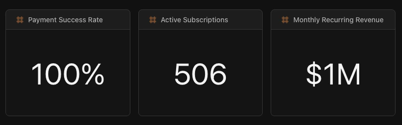
Use KPIs when you have a single number that stakeholders check regularly: total revenue, conversion rate, active users, or any metric that answers “how are we doing?”
# KPI showing total revenue collected in last 90 daysengine: "sql"sql: | SELECT SUM(amount) as total_collected FROM LAKE.STRIPE.charges WHERE status = 'succeeded' AND to_timestamp(created) >= CURRENT_DATE - INTERVAL '90 days'viz: type: "kpi" series: - field: "total_collected" format: "currency" # Display as $X,XXX colors: color: "#10b981" # Green
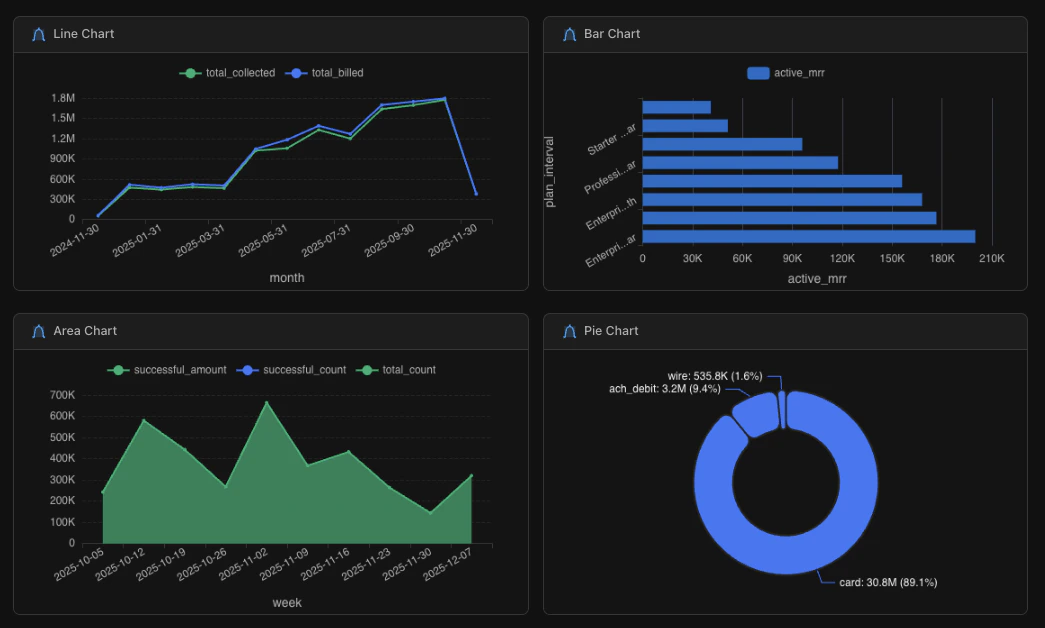
Use a line chart when showing how something changes over time: daily, weekly, or monthly trends. The x-axis is typically a date.Use a bar chart when comparing discrete categories: regions, products, or segments. The x-axis is typically a category name.
If you’re unsure, ask yourself: “Is time the main dimension?” If yes, use a line chart. If you’re comparing groups, use a bar chart.
engine: "sql"sql: | SELECT DATE_TRUNC('month', created_at) as month, SUM(amount) as revenue FROM orders WHERE created_at >= CURRENT_DATE - INTERVAL '12 months' GROUP BY 1 ORDER BY 1viz: type: "line" # Change to "bar", "area", or "pie" series: - field: "revenue" label: "Revenue" format: "currency" colors: palette: "default" # Or use color: "#3b82f6" for a specific hex legend: position: "top" # top, bottom, left, right orientation: "vertical" # Bar charts only: vertical or horizontal
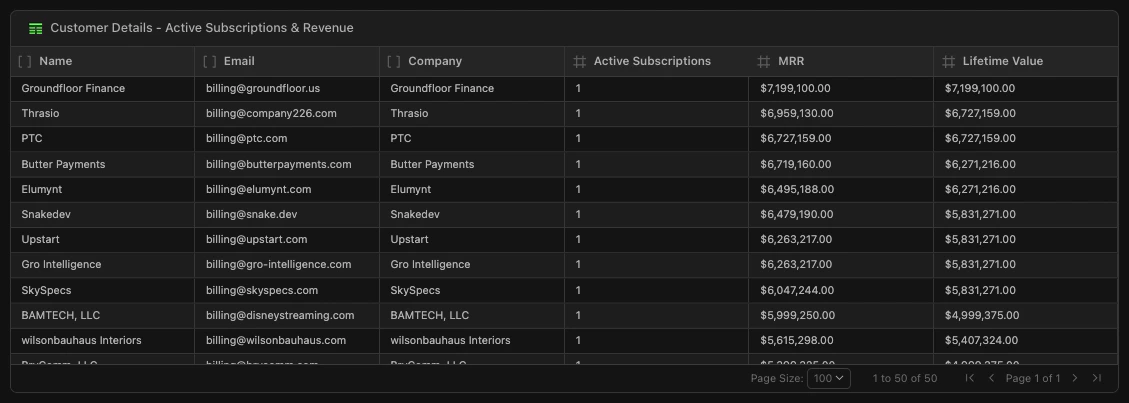
Table tiles display query results in rows and columns. They’re useful when users need to explore detailed data, drill into records, or export information.
Markdown tiles add formatted text to your Doc. Use them for section headers, descriptions, methodology notes, or any context that helps viewers understand your dashboard.
HTML tiles render data apps inside your Doc: source-authored React applications compiled to a single HTML file with client-side DuckDB WASM, Perspective.js, and a built-in component library. They go beyond standard tiles with interactive filters, pivot tables, ECharts visualizations, and fully custom layouts.