Documentation Index
Fetch the complete documentation index at: https://docs.definite.app/llms.txt
Use this file to discover all available pages before exploring further.
Users need the Admin role to create and edit tiles. Analysts have read-only access.
Tile principles
- Every tile has two parts: The data (SQL, Python, or markdown) and the visualization (YAML configuration). You define what to show, then how to show it.
- Fi handles most of the work: Describe what you want in plain English, and Fi generates both the query and visualization. You don’t need to write SQL or configure YAML unless you want to.
- Tiles are composable: Start simple with a few KPIs, then layer in charts and tables. Each tile is independent, so you can mix and match freely.
Tile types
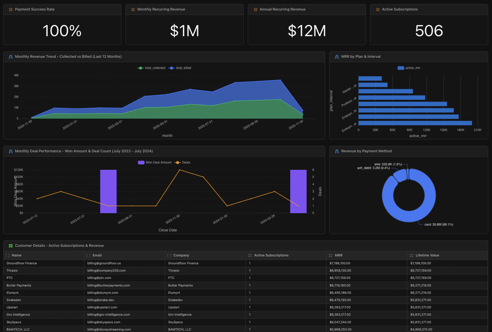
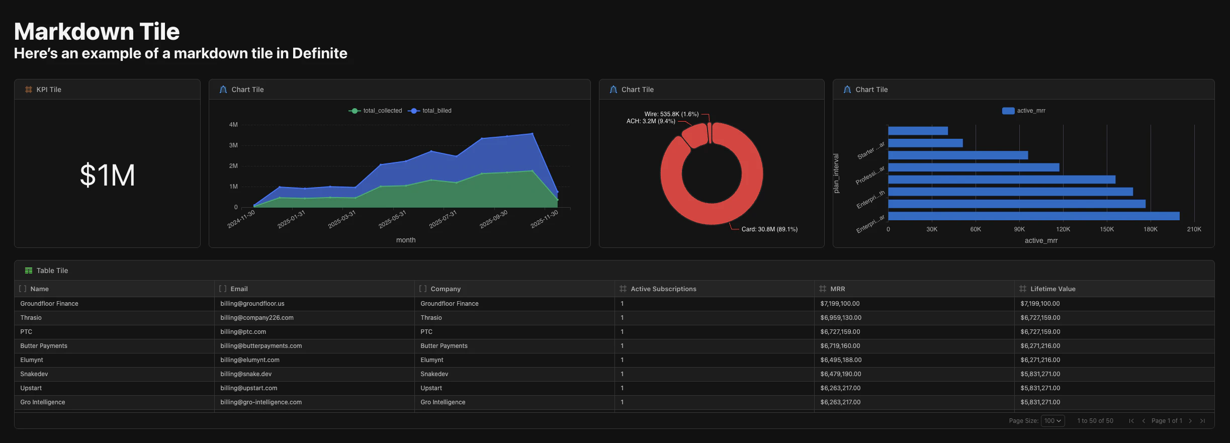
Definite supports four tile types:| Type | Purpose | Best for |
|---|---|---|
| KPI | Display single metric values prominently | Revenue totals, counts, percentages |
| Chart | Visualize data graphically | Trends, comparisons, distributions |
| Table | Show data in rows and columns | Detailed data, drill-downs |
| Markdown | Add formatted text | Headers, descriptions, documentation |
| HTML (Data App) | Custom interactive applications | Client-side filtering, pivot tables, AI Q&A |
When should I use each tile type?
| If you want to… | Use |
|---|---|
| Highlight a single number executives check daily | KPI |
| Show how a metric changes over time | Chart (line or area) |
| Compare values across categories | Chart (bar) |
| Show proportions of a whole | Chart (pie) |
| Let users explore raw data or drill into details | Table |
| Add context, headers, or documentation | Markdown |
| Build a fully custom interactive experience | HTML (Data App) |
Creating tiles
Using Fi (recommended)
The fastest way to create tiles is with Fi. Just describe what you want:- “Show me total revenue collected in the last 90 days as a KPI”
- “Create a line chart of monthly signups for the past year”
- “Add a table of our top 10 customers by lifetime value”
Creating tiles manually
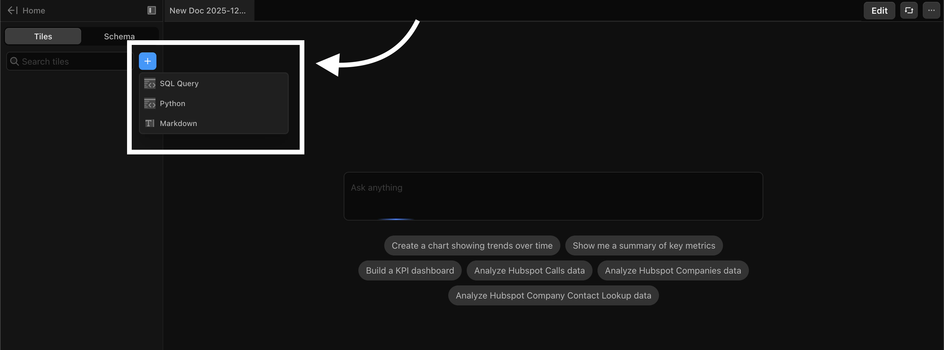
If you prefer to write your own queries:- Click the + button in the Tiles panel on the left sidebar
- Choose how you’ll define the data:
- SQL: Query your connected data sources
- Python: Run Python code for complex transformations
- Markdown: Add formatted text for headers and documentation
- Write your query or content
- Configure the visualization using the settings panel or YAML
Tile configuration with YAML
Every tile’s visualization is controlled by YAML. Here’s an example of a KPI tile showing payment success rate:engine specifies SQL or Python. The sql (or python) block contains your query. The viz block controls how it displays: type, formatting, colors, and styling.
Common tile properties
All tiles share these properties:| Property | Description |
|---|---|
id | Unique identifier for the tile |
type | The tile type (kpi, chart, table, markdown) |
title | Optional title displayed above the tile |
x, y | Grid position (column, row) |
w, h | Size (width and height in grid units) |
source | Reference to a dataset (for kpi, chart, table) |
Layout and organization
Tiles are arranged on a grid system. Click the Edit button in the top toolbar to enter edit mode, then:- Drag tiles to reposition them
- Resize tiles by dragging their edges
- Group related tiles together for better readability
Next steps
Tile Types Reference
Configuration options and examples for each tile type
Data Apps
Build interactive HTML applications with custom visualizations
Uploading Files
Learn how to upload CSV files for analysis